How Editing Styles Affect an Entire Wedding Gallery
When couples think about photo editing, they usually picture a single image. It might be a darker portrait saved from Pinterest or a bright, airy photo shared on Instagram. The decision feels aesthetic almost like choosing a filter. What often gets overlooked is scale.
A wedding gallery is not ten curated photographs designed for social media. It is hundreds of images captured across changing light, multiple environments, and different moments throughout the day. An editing approach that looks compelling in one frame may behave very differently across an entire collection.
Over the past decade, darker editorial tones became popular because they created immediate visual impact. Strong contrast and deeper shadows stood out in crowded feeds. On a backlit screen, that depth can feel cinematic and dramatic. For a single image, the effect can be powerful.
But a wedding is not a single image.
One image can look dramatic. Five hundred images can feel heavy.
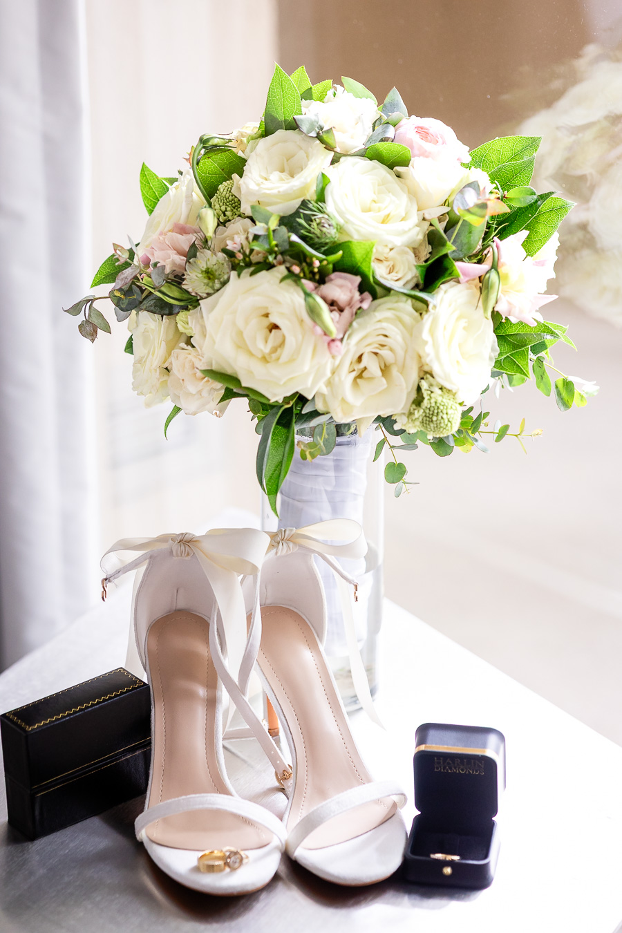
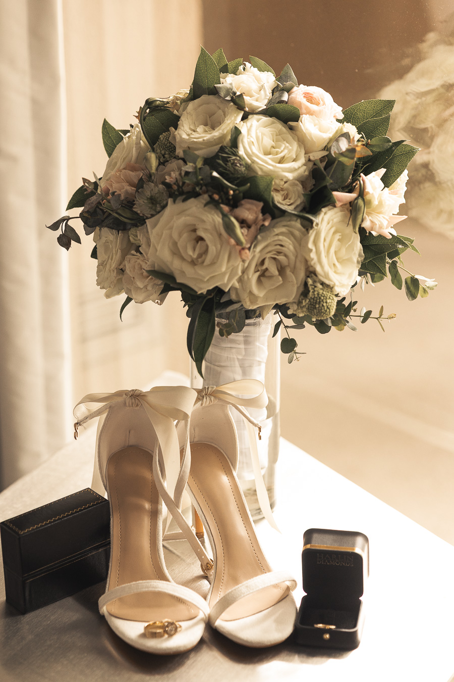
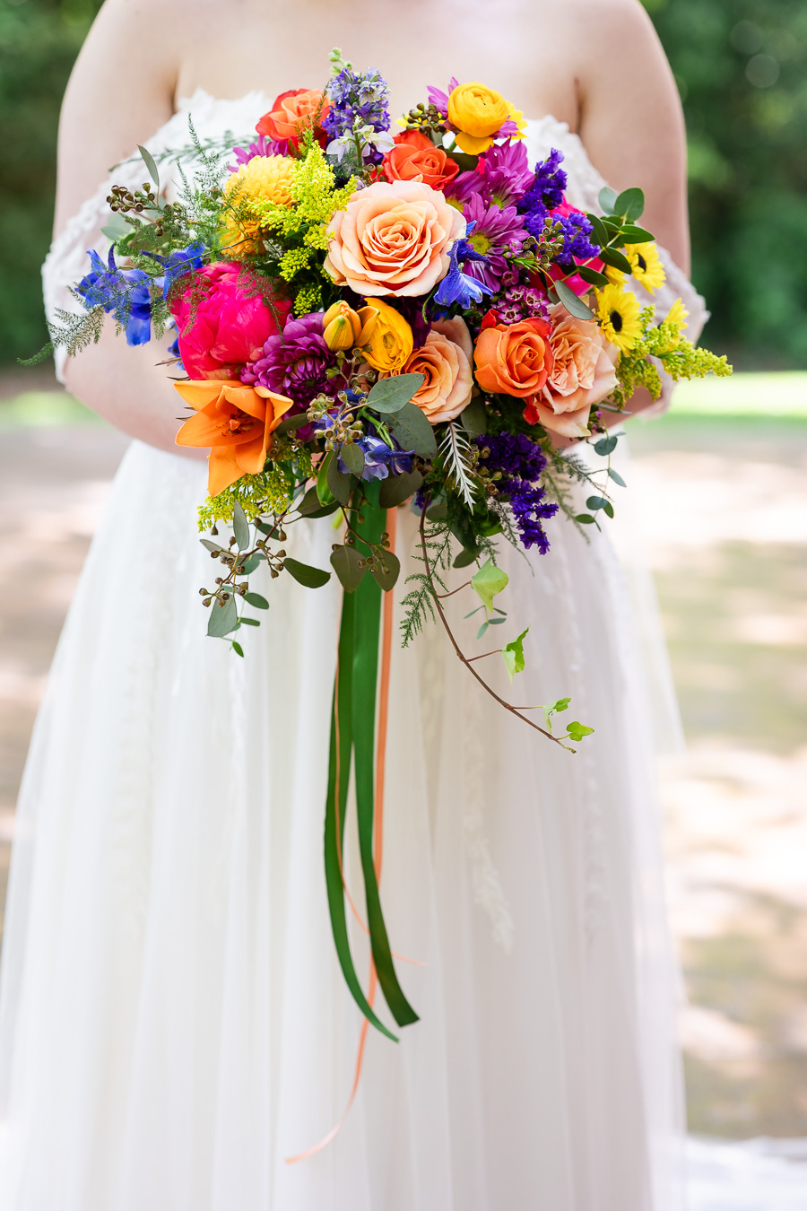
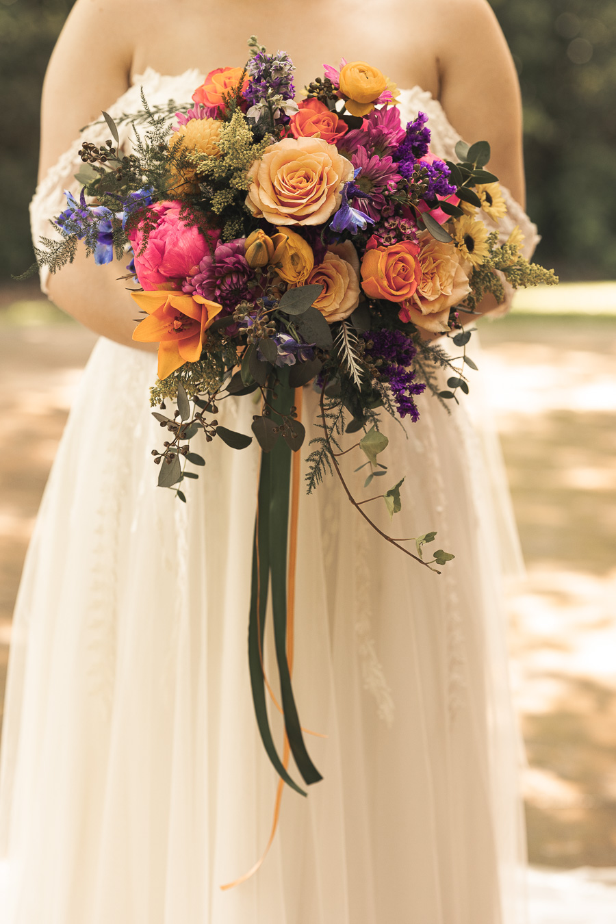
When stronger contrast is applied consistently across a full gallery, subtle details begin to shift. Cakes can lose texture. Florals may no longer reflect their original tones. Whites can drift toward cream. Greens can lean olive depending on the lighting conditions. Skin tones respond differently in a ballroom at night than they do during an outdoor ceremony in open shade. Morning light, sunset light, indoor tungsten lighting, and LED reception lighting all introduce different color challenges.
An editing approach must handle all of those environments without losing balance.
There is also a practical difference between how images appear on screens and how they appear in print. Screens emit light; paper absorbs it. A shadow-heavy image that feels rich and bold on a phone can appear denser once placed in an album under normal room lighting. This is not a matter of taste. It is simply how light behaves.
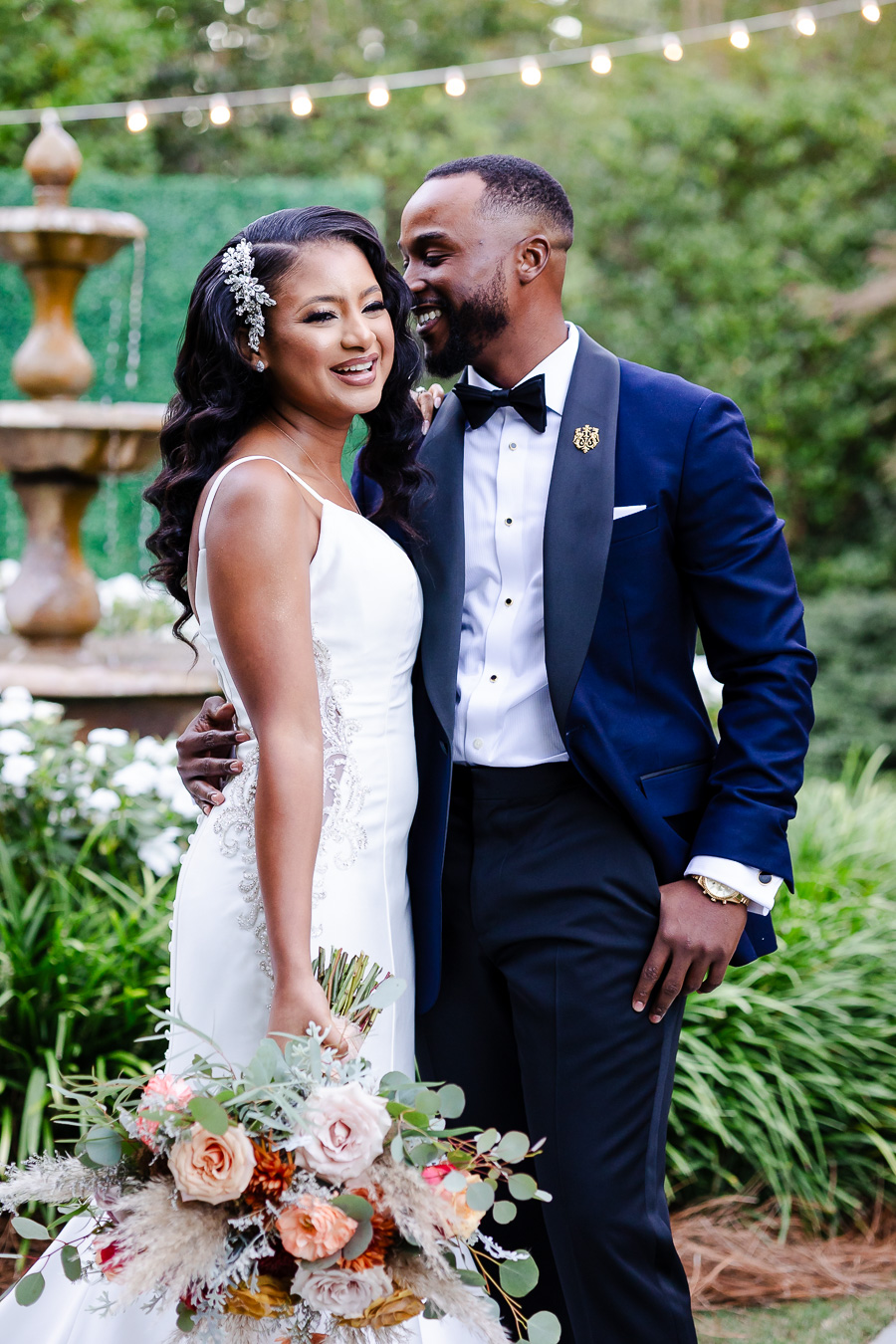
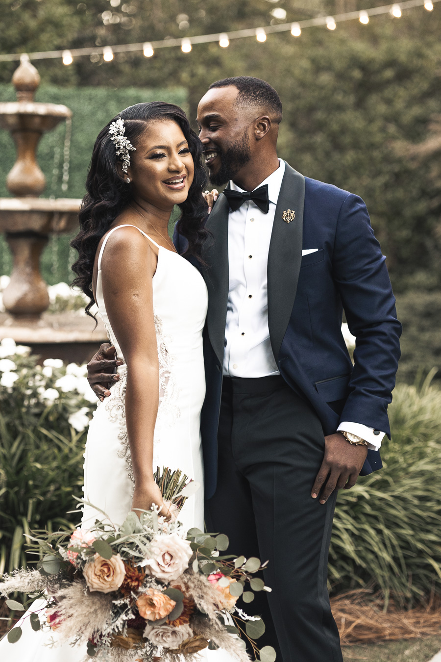
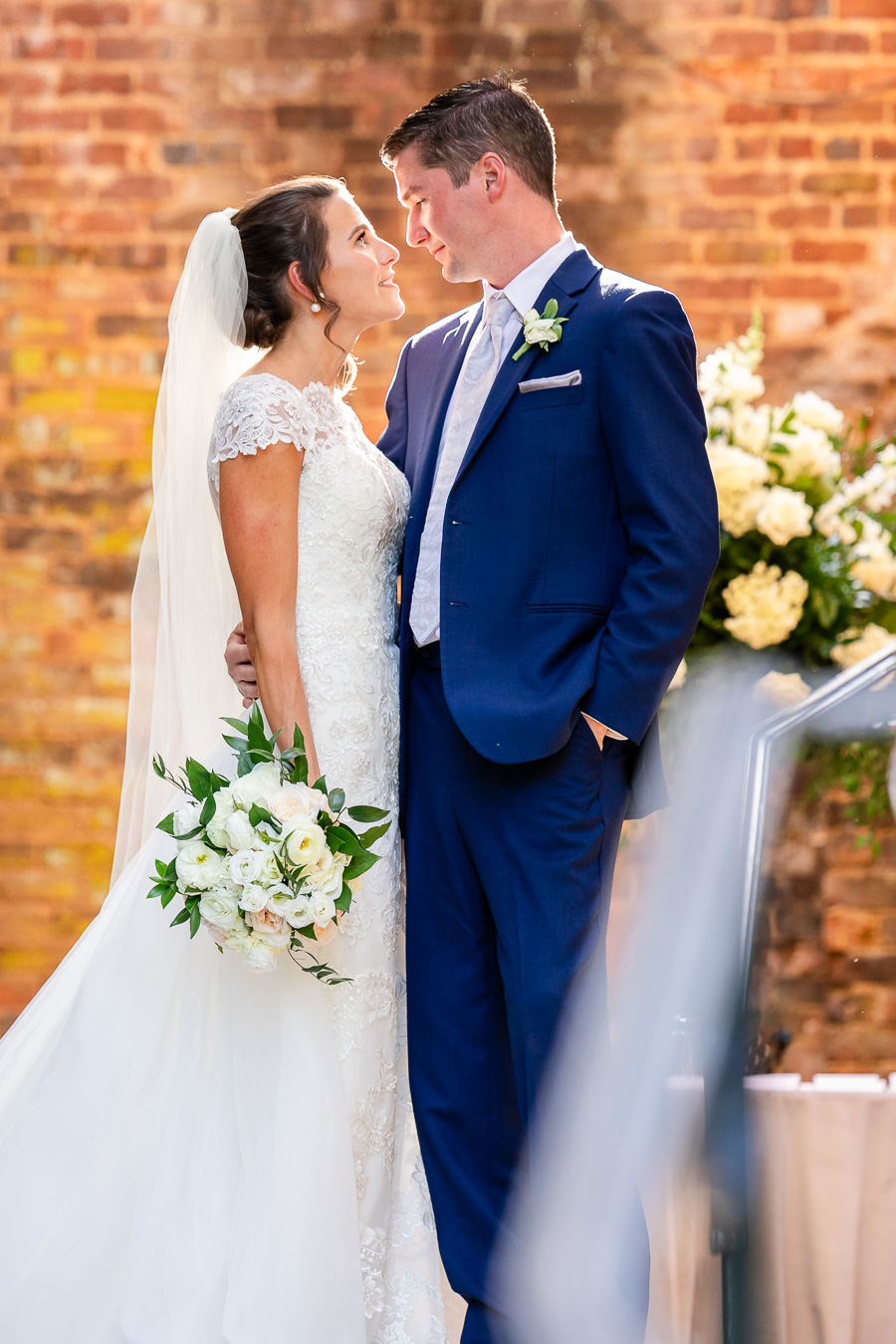
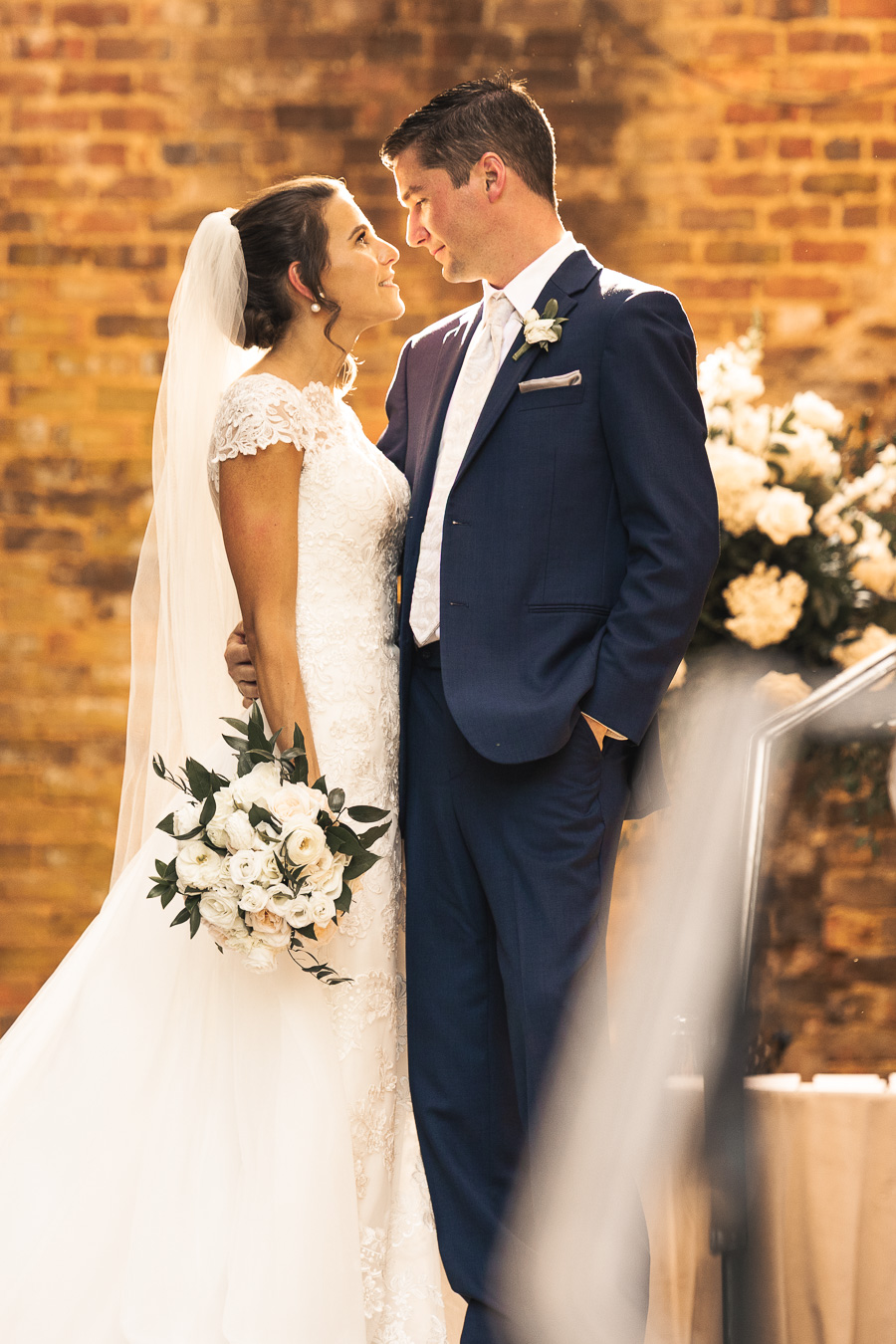
For these reasons, I deliver one consistent color standard: Cristian López Timeless Modern. This approach is built on balance and cohesion rather than trend-driven contrast. It prioritizes natural skin tones, controlled highlights, and shadows that retain detail. The goal is not to brighten everything randomly, nor to mute the scene for effect, but to preserve what was present in a way that remains consistent from beginning to end.
Consistency does not mean every image looks identical. Every photographer develops a recognizable way of finishing their work over time. Some lean slightly warmer. Others prefer a softer contrast. Subtle choices are always being made so the gallery feels balanced and cohesive from beginning to end.
The difference is intention and moderation. The goal is not to dramatically shift colors or reshape the scene, but to refine what was already there so it feels natural and connected throughout the day.
An editing style should support the atmosphere of the day without competing with it. The ceremony, the reception, the décor, and the people should feel connected within the same visual language. When a gallery transitions naturally from getting ready to the final dance without shifting personalities halfway through, it feels cohesive.
Editing is often discussed as preference. In practice, it is a decision about how an entire body of work will live over time on screens, in print, and in spaces where lighting conditions vary. A consistent standard protects that longevity.